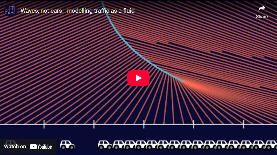
Waves, not cars – modelling traffic as a fluid

We give a visual introduction to the Lighthill-Whitham-Richards model of traffic flow and the method of characteristics. Through this model, we study examples of light and heavy motorway traffic, traffic lights, and the use of variable speed limits.

We give a visual introduction to the Lighthill-Whitham-Richards model of traffic flow and the method of characteristics. Through this model, we study examples of light and heavy motorway traffic, traffic lights, and the use of variable speed limits.

Full Video

Transcript with video snippets

Traffic as a fluid

An interesting way to think about traffic on a large scale is as a fluid. To model a fluid, we usually don’t think of individual molecules, but rather of macroscopic properties such as its density. In the same spirit, we can plot the density of the traffic and disregard the position of the individual cars.

So let’s draw a plot of the traffic density, which we denote by the greek letter \(\rho\) (rho).

As the cars move along the road, the plot of the density will change shape. Can we predict how it will change over time without modelling the actual cars?

How do we model traffic if all we know is its density? A first step is to estimate how fast a car would be driving depending on the density of traffic it’s in. A fair assumption is that the denser the traffic is, the slower the cars will be. When traffic is very light, cars drive at their maximum speed, \( v_{max} \). When there is some traffic, cars drive at some slower speed. And when traffic is bumper to bumper, the cars don’t move at all.

So the graph of speed over density should slope down. It could take many different shapes, but for now, let’s take the simples possible option: a linear relation. The graph is a straight line, connecting a certain maximum speed when the density is zero, to a speed of zero when the density is maximal.
Let’s normalise density and speed. This means we choose use units of density and speed such that the maximum density and speed are both equal to one. This will simplify the formulas a little.

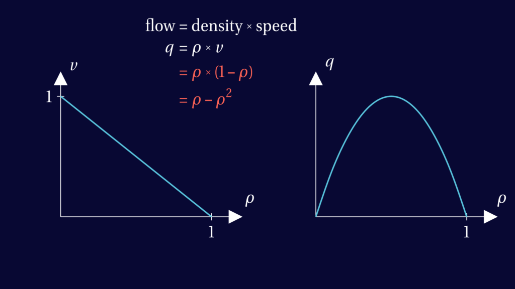
When analysing road traffic a key quantity is the flow \(q\): the amount of cars passing a fixed point per unit of time. The flow is equal to traffic density times the speed of the cars.

In the image below, formulas specific to our model are shown in red. In our model, the flow is a quadratic function of density. Its graph is a parabola which reaches its maximum at half the maximum density.
To turn these graphs of speed and flow into an equation for how the density evolves, all we need to do is look at the conservation of the number of cars. Our model should not create or remove cars. From this we can derive an equation for traffic flow.

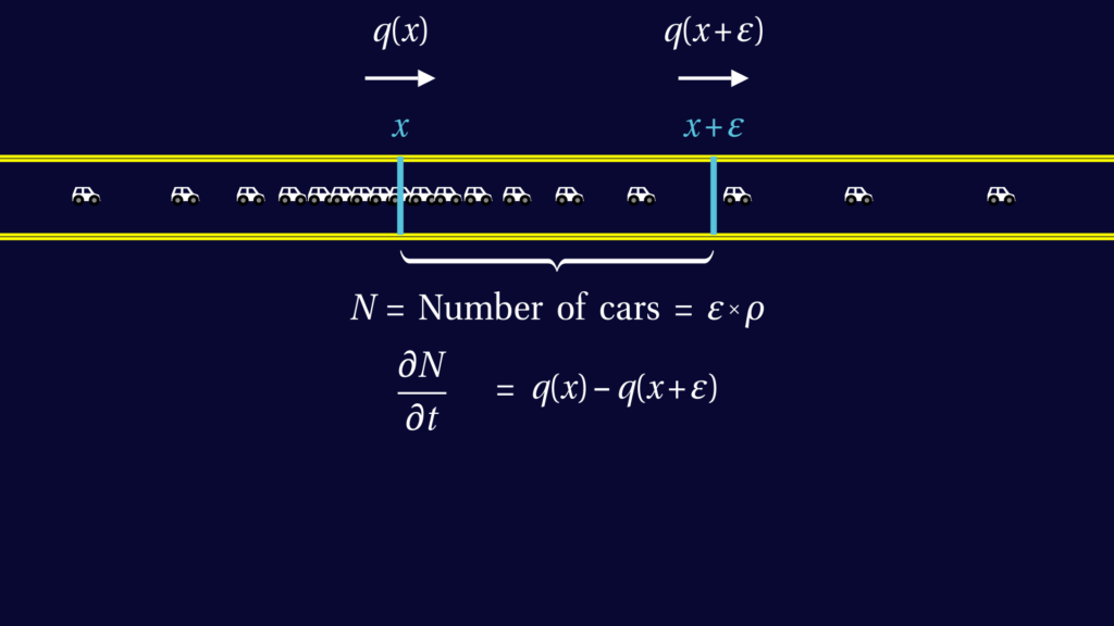
To start the derivation, consider a short stretch of road, say between coordinates \(x\) and \(x+\varepsilon\). The total number of cars in this interval is approximately given the length of the interval \( \varepsilon \) times by the density \(\rho\).

The number of cars going into this interval per unit of time is given by the flow \(q(x)\). The number of cars leaving the interval in the same unit of time is the flow \(q(x+\varepsilon)\).

So the change in number of cars over time is given by the difference in flow at \(x\) and \(x+\varepsilon\): $$ \frac{\partial N}{\partial t} = q(x) – q(x+\varepsilon).$$
On the left hand side, we can plug in the formula for the number of cars, \( N = \varepsilon \rho \) to find $$ \varepsilon \frac{\partial \rho}{\partial t} = q(x) – q(x+\varepsilon).$$ Rearranging this gives $$ \frac{\partial \rho}{\partial t} + \frac{q(x+\varepsilon) – q(x)}{\varepsilon} = 0.$$

Letting epsilon tend to zero, we recognise the derivative of \(q\) with respect to \(x\). So, we find $$ \frac{\partial \rho}{\partial t} + \frac{\partial q}{\partial x} = 0.$$

With the chain rule, that turns into $$ \frac{\partial \rho}{\partial t} + \frac{\partial q}{\partial \rho} \frac{\partial \rho}{\partial x} = 0.$$

This equation relates the time-derivative of rho to its space derivative.

In our model, where \(q=\rho – \rho^2\), we have \( \frac{\partial q}{\partial \rho} = 1 – 2 \rho \).

Equations like this are called partial differential equations. The word “differential” indicates they involve derivatives, the word “partial” that there are derivatives with respect to several variables, here \(t\) and \(x\).

Method of characteristics

There is no general method to solve differential equations. But this one allows a nice trick, known as the method of characteristics.

The inspiration for this method comes from looking at a nearly constant traffic density with a small disturbance. We see that this small bump in the density moves with a constant speed. This speed is smaller than the speed of the cars!

In heavy traffic, the bump even moves backwards, against the direction of traffic.

This suggest that we should not be tracking how individual cars more, but how how waves of constant density move.

Imagine a helicopter flying over the densest bit of traffic. It does not follow an individual car – it follows a wave in traffic.

A space-time plot of the helicopter’s trajectory is called a characteristic. It is a line formed of points in space-time which all have the same traffic density.

Let’s draw many different characteristics, so that the space-time plot is almost filled with them. If we want to know the traffic density at a certain point with space-time coordinates \((x,t)\), all we have to do is to find a characteristic that goes through the point \((x,t)\). The density of that point will be equal to the density at time zero at the point where the characteristic originated.

Now, how do we know what the slope of a characteristic should be? Put differently, what speed the helicopter should be doing to make sure it sees the same density at all time?

Suppose the helicopter is flying at a certain speed c. The change it will observe in the traffic density rho is made up of two parts. One part is how rho itself is changing through time: \(\frac{\partial \rho}{\partial t}\). The other part is due to the helicopter’s motion: \( c \frac{\partial \rho}{\partial x}\) (once again, this is the chain rule at work). We want the helicopter to see a constant density, so we want this total change to be zero.

If we compare this to the partial differential equation for the traffic density rho, we see that the equations are almost the same. In particular, if $$ c =\frac{\partial q}{\partial \rho}$$ then the helicopter will see no change in density. This is exactly what we want, so this is the formula for the speed of the helicopter, or in more abstract terms, for the slope of a characteristic.
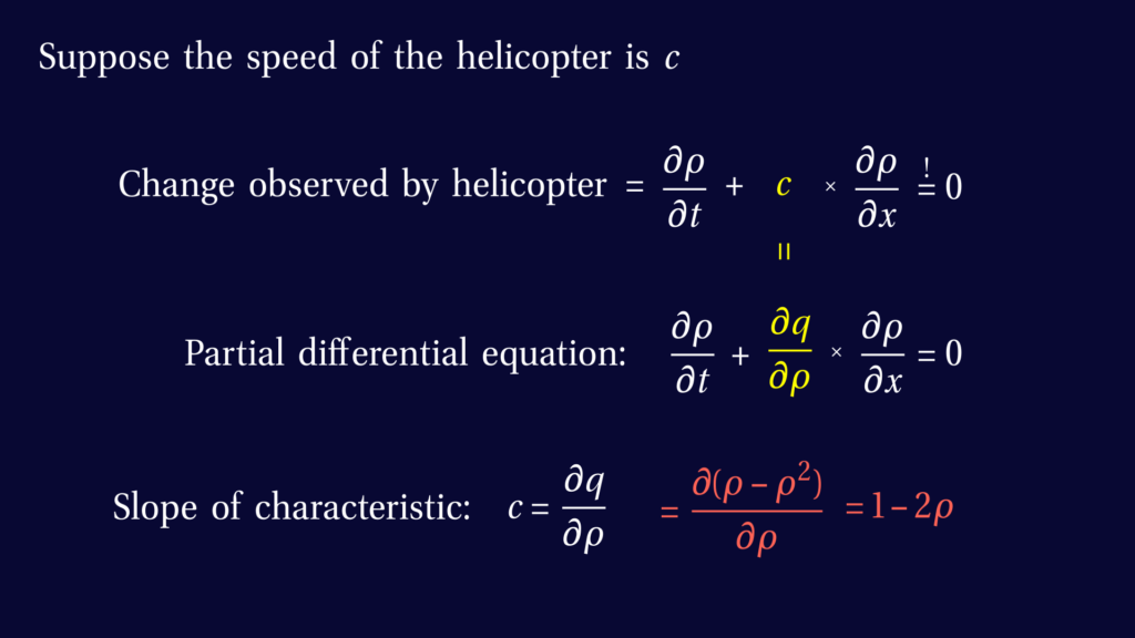
Recall that in our model, the flow q is a quadratic function of the traffic density rho. We find that the slope of the characteristic is \( 1 – 2 \rho \).

Reconstructing the density profile

Note that in light traffic, when \( \rho < \frac12 \), \(c\) is positive so characteristics slope forward. But in heavy traffic, when \( \rho > \frac12 \), \(c\) is negative so characteristics slope in the opposite direction.

Conversely, if we see the plot of characteristics, we can tell by their slope what traffic density they corresponds to. Suppose we want to reconstruct the plot of density at a certain time. First, we draw the horizontal line corresponding to this time in the space-time plot. Then, for each \(x\)-coordinate, we look at the slope \(c\) of the characteristic intersecting our line at that \(x\). From its slope we know the density. Sloping backwards means high density, sloping forwards means low density.

This way, we can read off the density profile from the plot of characteristics

When the initial traffic density is decreasing along the road, like this, the characteristics fan out. The gaps between characteristics are not a problem, because mathematically there are infinitely many of them. The gaps are there because we chose to draw only a few, so if we find a gap is getting too big, we can simply draw an additional characteristic in the gap. If you prefer, we could have drawn these extra characteristics from the start.

If the initial traffic density increases from left to right, the characteristics slope towards each other. At some point they intersect. If we have several characteristics going through the same point, we will find several different values when we try to reconstruct the density curve. So instead of the graph of a function, we get a meaningless S-shaped curve.

So we cannot have intersecting characteristics. Instead, when characteristics meet, they form a shock. This corresponds to a jump in the graph of density over \(x\).

The speed of the shock will have to be somewhere between the speeds of the intersecting characteristics.

The exact speed of the shock is determined by the fact that the flow into the shock should be the same as the flow out of the shock. But this is not the absolute flow q, but the flow as observed by someone moving with the shock.

Let’s say the speed of the shock is \(v\), then someone moving with the shock, staying just to the right of it, will observe a flow of
$$ q(\rho_\text{right}) – \rho_\text{right} v ,$$
where $\rho_{right}$ is the density the the right of the shock. Similarly, an observer following the shock on its left hand side will observe a flow of
$$ q(\rho_\text{left}) – \rho_\text{left} v .$$
Conservation of cars implies that these two flows must be equal, so we find that
$$ v = \frac{\rho_\text{left} – \rho_\text{right}}{q(\rho_\text{left}) – q(\rho_\text{right})} .$$
(This is known as the Rankine–Hugoniot condition.)

Examples on the motorway

Now we have all the tools to solve the traffic equation with the method of characteristics. Let’s look at a few examples.

First let’s consider big lump of traffic on an otherwise nearly empty road.

We see that a shock forms at the tail end of the queue. Initially, it moves backwards quite quickly, but then it slows down and the size of the jump in density starts to go down.

In real traffic, a shock is not concentrated in a single point like on our graph, but slightly spread out over a section of road. Furthermore, our model does not take into account that good drivers look far ahead to anticipate what will happen and adjust their driving accordingly. This will also help smooth out traffic compared to what we simulate in this model. But at a large scale, our model often gives a good indication.

Next, let’s look at a lump of denser traffic on a road that already has heavy traffic. Remember that heavy traffic means the density is more than half the maximum density and that the characteristics move backwards.

Again the shock that is formed moves backwards. And now it keeps going backwards. And the peak in density stays large. This is the situation when on a busy motorway, the traffic can be flowing nicely one moment, but the next instant you see a wall of brake lights moving towards you.

Let’s go back to light traffic, with a region of somewhat denser traffic, but remaining less than half the maximal density.

Maybe you’d expect the lump to be smoothed out without issue, but a shock is still formed. However, in light traffic like this, shocks moves forward, just like the characteristics. This means that from the perspective of a driver, the relative speed at which you approach the shock is much lower than in heavy traffic.

Combine this with the fact that real-life shocks will be a smoother version of what we simulate here, and it seems plausible that a shock in light traffic may not even be noticeable to the drivers. In any case it will be a much gentler affair than a shock in heavy traffic.

A traffic light

Next let’s look at a traffic light. When the light is on red, our model does not really apply to what is beyond the traffic light. But since no traffic can go past the red light, we could imagine the rest of the road to be completely full, with characteristics sloping backward. After all, a completely full road is also a way of modeling traffic that isn’t moving forward.

Unsurprisingly, a shock forms at the back of the growing queue.

When the light finally goes green, the initial traffic density is at its maxium on the left and zero on the right. This gives us the most extreme version of characteristics fanning out. The corresponding density plot after some time is a linear interpolation between the bumper-to-bumper queue on the left and the empty road on the right.

Note that the distances from the traffic light to the regions with full and zero density are the same. So if you imagine traffic going both ways, this would mean a car in the queue starts moving exactly when the first car going the other direction drives past it. Our model is way to simple to accurately capture such details of real life traffic. But still, when you are stopped at a pedestrian crossing, it does seem that you often start moving around the same time that the cars going the other way start coming past.

Active traffic management

let’s return to the motorway, where now the traffic density is half the maximal density on average, but fluctuates quite a lot. We see that many shocks are formed, and only very slowly do they decrease in size. It takes a very long time for the density to approach a uniform one.

However, in real life, sooner or later a careless driver will force another to slam on the brakes, creating new fluctuations, which then lead to new shocks. Is there anything the authorities could do to minimise the effect of such fluctuations on a fairly busy road?

There is. But it’s a measure that isn’t always welcomed by drivers. They could impose a speed limit.

Let’s go back to the basics of our model. So far, we assumed that the speed of the traffic is a linear function of traffic density. But if we impose a speed limit, then the graph changes as shown below. Here, the speed limit we chose is the speed cars would do at half the maximal density.
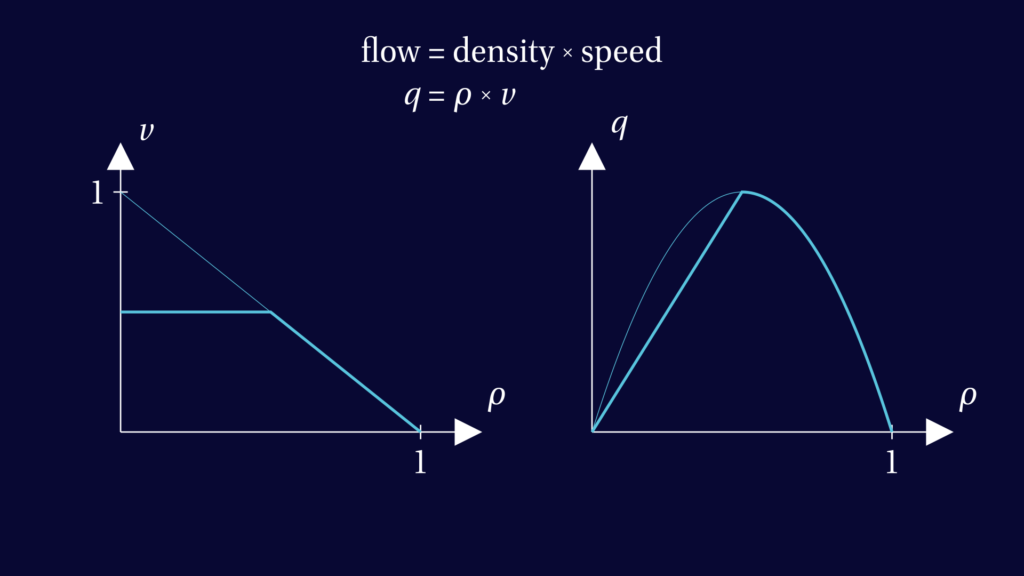
The graph of traffic flow, that is density times speed, now changes from a parabola to something that has a straight line as its first half.

This is notable, because the slope of this graph is what determines the slope of the characteristics. So with speed limit, all characteristics corresponding to light traffic will have the same slope.

Indeed, if traffic is light everywhere, the density profile now just moves to the right. Since all cars are driving the speed limit, the shape of the graph does not change, it just moves to the right uniformly.

But if we look back at the fluctuating traffic density from earlier, the shocks are dissipated much more quickly if the speed limit is imposed. And the traffic uniformises to a density of half the maximum quite quickly (which is the density at which the greatest possible flow is achieved).

Compare this to the simulation at the start of this section, with the same initial density and no speed limit. On the same time scale, there were still several shocks – many places where the traffic has to slam on the brakes.

So when there is a temporary speed limit on the motorway when there is no obstruction and traffic is flowing nicely, it is likely that the traffic density is such that big shocks would be forming if that speed limit wasn’t imposed. So it’s not that the speed limit is unnecessary because there’s no congestion. The speed limit has done its job and prevented queues forming!

Of course, to the road user it may appear as a useless speed limit. There’s no glory in prevention.

Or maybe, someone in a Birmingham office pressed the wrong button causing a single gantry on an empty A1M to show a 40 mile an hour speed limit. Who knows…

Notes

The Lighthill-Whitham-Richards model is also known as the kinematic wave model of traffic flow.

The original paper by Lighthill and Whitham is surprisingly readable:
Lighthill, Whitham (1955) On kinematic waves II. A theory of traffic flow on long crowded roads.

A textbook reference we found useful is:
Richard Haberman (1977) Mathematical Models: Mechanical Vibrations, Population Dynamics, and Traffic Flow. Prentice-Hall, New Yersey.

Another textbook, with more mathematical detail, is
Sandro Salsa, Gianmaria Verzini (2022) Partial Differential equations in Action. Fourth edition. Springer, Cham.

Optimising traffic flow through measures like variable speed limits is called active traffic management.

In theory, a shock will never disappear, but when a shock gets so weak that the difference in density on either side is negligible, we may for all practical purposes ignore it, which is why we stop drawing some of them on the space-time plot.

Manim code is available at https://github.com/mvermeeren/SoME4

Animations created with help of Matthew Truman.

This video is supported by the Engineering and Physical Sciences Research Council (EP/Y006712/1) and Loughborough University as part of my outreach work. Any mistakes or opinions in this video are my own.
Iterations and chaos

A two-part video on iterations and chaos. The first part reviews some textbook material on the concept of iterations and how to visualise them. The second part has the more ambitious goals of understanding the titular claim of a 1975 paper by Tien-Yien Li and James A Yorke: period three implies chaos.

A two-part video on iterations and chaos. The first part reviews some textbook material on the concept of iterations and how to visualise them. The second part has the more ambitious goals of understanding the titular claim of a 1975 paper by Tien-Yien Li and James A Yorke: period three implies chaos.

The shapes of waves of ships and ducks

A video about the pattern of waves making up the wake of a ship or a duck. This is a common topic in university-level fluid mechanics courses, but my intention was to give a fairly complete explanation without assuming any more advanced knowledge than trigonometry.

A video about the pattern of waves making up the wake of a ship or a duck. This is a common topic in university-level fluid mechanics courses, but my intention was to give a fairly complete explanation without assuming any more advanced knowledge than trigonometry.

Full Video

Edited transcript with video snippets

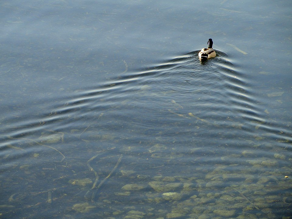
A duck swimming on a calm body of water leaves a pattern of waves in its wake. A very similar wake occurs behind small boats and giant ships.

The wake is a V consisting of feathery waves. Inside of it we see fainter parallel crests following the duck.

Surprisingly, the angle of the V is the same for all these vessels and waterfowl. It always will be, as long as a few simple assumptions are satisfied. To explain why, we need to know a little about the nature of water waves.

Before we consider moving ships or ducks, let’s have a look at waves produced by a disturbance at one place and one instant in time. For example, if we throw a pebble into the water. After the initial mayhem in the centre has died down, we see circular waves propagating outwards.

Looking closely, we see that these waves aren’t as simple as we could have expected. On the outside the waves seem to have a longer wavelength:  the crests are further apart than on the inside.

In other words, the longer waves have travelled faster.

When looking at waves in a pond, or in almost any real-life example of water waves, we see a mixture of wavelengths. If we could separate them out into perfect waves of one particular wavelength each, the picture would look like this.

Long waves move more quickly than the short ones. It turns out that, in deep water, the speed of a wave is proportional to the square root of its wavelength. This dependence of wave speed on wavelength can be mathematically derived from a suitable mathematical model of water waves, but we will just take it as an experimental fact and move on.

Sine waves

Waves of a pure wavelength are often called sine waves because their shape is described by a sine function

$$ \sin(k x) . $$

The constant \(k\), called the wave number, determines the wavelength: the sine function will give the same value if \(kx\) increases by 360° (or \(2 \pi\) if you prefer radians), i.e. if \(x\) increases by \(\frac{360^\circ}{k}\). This means that the wave repeats itself every time we move a distance of \(\frac{360^\circ}{k}\). This distance is the wavelength, denoted by the Greek letter lambda:

$$ \lambda = \frac{360^\circ}{k} . $$

In particular, a bigger value of \(k\) leads to shorter waves.

If we change the argument of the sine function by some number \(a\), the whole profile shifts. If this number increases in time,  we get a moving wave. Writing the number \(a\) as \(\omega t\), where \(\omega\) (Greek letter omega) is a constant and \(t\) is time, we get the formula for a moving wave.

$$ \sin(k x – \omega t) $$

The constant \(\omega\) is called the angular frequency of the wave, or simply the frequency. To determine the speed of the wave, we look for values of \(x\) and \(t\) (space and time) such that the argument of the sine function remains constant, let’s say equal to zero. This is the case if

$$\frac{x}{t} = \frac{\omega}{k} . $$

In this formula, \(\frac{x}{t}\) (position over time) is the wave’s velocity, so we find a formula for the wave’s velocity:

$$ v = \frac{\omega}{k} . $$

Let’s put our observation about the wave speed of deep water waves into this language. The speed equals \(\frac{\omega}{k}\) and is proportional to the square root of the wavelength:

$$ \frac{\omega}{k} \sim \sqrt{\lambda} . $$

But the wavelength itself is proportional to \(\frac{1}{k}\). Putting this together reveals that omega must be proportional to the square root of the wave number \(k\):

$$ \frac{\omega}{k} \sim \sqrt{\frac{1}{k}} \qquad \Rightarrow \qquad \omega \sim \sqrt{k} . $$

Group velocity

Let’s have another look at the circular waves. Unlike the sine waves we just saw, the crests are not moving with the same speed as the waves as a whole. Crests seem to appear at the back of the group, then overtake the group and disappear at the front.

The speed of the individual crests is called the phase velocity and the speed of the group as a whole is called the group velocity. They are different because the wave we’re looking at is not a single sine wave, but a superposition of many of them

The best way to understand how this happens is to look at the superposition of only two sine waves, with wave numbers that are almost the same, but not exactly. Let’s call them \(k\) and \(\bar k\). Superposition means taking the sum of the two waves. In some places their crests overlap to sum to a wave twice the size. In other places a crest of one wave coincides with the trough of the other and their sum will be very small.

We see that individual wave crests move faster than the large features of the white wave. There are two different speeds associated with this combined wave. To find out what those two speeds are, we need a bit of trigonometry.
We’re dealing with the sum of sine functions. Using a sum-to-product identity, we can turn this into a product of a sine and a cosine:

$$ \sin(k x – \omega t) + \sin(\bar k x – \bar \omega t)
= 2 \sin\!\left( \frac{k + \bar k}{2} x – \frac{\omega + \bar \omega}{2} \right) \cos\!\left(\frac{k – \bar k}{2} – \frac{\omega – \bar \omega}{2} t \right) $$

The point of this calculation is that we’ve now written the superposition as a product of two waves. The first one is described by a sine function and has a wave number and frequency very close to the \(k\)s and \(\omega\)s of the two waves we combined. The second one is described by a cosine instead of a sine, but that in itself doesn’t really change much. However, its wave number and frequency however are quite different. We learned that the speed can be calculated by dividing the frequency by the wave number, so the speed of the cosine wave is given by

$$ \frac{\omega – \bar \omega}{k – \bar k} . $$

Now we start to understand the combined wave. It consists of a wave with about the same properties as the two waves we started with, multiplied with an additional wave with different properties. The first wave (blue) still determines the speed of the wave crests, called phase velocity. But the second wave (yellow) wave determines the group velocity, the speed at which the larger wave packets move.

For those of you who know calculus, there is a more enlightening way to write the group velocity. So far we’ve written the speed of the cosine wave as a fraction. You may recognize this fraction from the definition of a derivative. If \(k\) and \(\bar k\) are close to each other, it will be a very good approximation of the derivative of \(\omega\) with respect to \(k\). By this argument, the group velocity of a wave packet is given by \(\frac{\text{d} \omega}{\text{d} k}\).

Earlier we learned that, for deep water waves, the frequency \(\omega\) is proportional to \(\sqrt k \), say \(\omega = \alpha \sqrt{k} \) for some constant \(\alpha\). Using this, we can derive that the group velocity is exactly half of the phase velocity:

$$ v_{\text{group}} = \frac{\text{d} \omega}{\text{d} k}
= \frac{\text{d}}{\text{d} k} \alpha \sqrt k
= \frac{\alpha}{2 \sqrt{k}}
= \frac{\omega}{2 k}
= \frac{1}{2} v . $$

This is a key result for deep water waves: wave packets move at half the speed of individual wave crests. Group velocity is half the phase velocity.

Ducks

Now we are ready to talk about the wakes of cargo ships and sailing yachts. Or ducks!

Let’s start by looking at a single point in the wake of the duck. Since not all waves travel at the same speed, the waves that we observe at this one point in the wake originated at many points along the duck’s past trajectory. So the disturbance we observe is the sum of many contributing waves, a few of which are illustrated here.

For each contribution we draw an arrow at the point where it originated. This illustrates that every point along the trajectory contributes a little something to the observed wave. Some contributions are upwards and some downwards Often they mostly cancel each other out, but this depends on where we take our observation. For some observation locations, a large section of the trajectory will contribute in the same direction. In these places we observe a disturbance in the water surface. In other words, we see a wave whose height is represented by the white arrow.

To get a picture of the wake of the duck we repeat this exercise for many points in the water. This time we don’t draw the individual contributions of
points on the trajectory, only the observed wave heights. As the grid gets finer, we start to recognize the V-shaped wake.

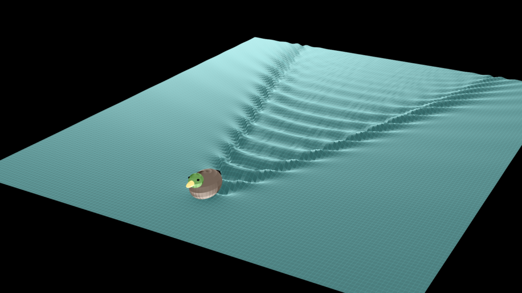
Since the arrows indicate the height of the water, we may as well do away with arrows and plot the surface of the water.

This looks very much like a real wake!

But why is the wake confined to this V shape? And why is the shape the same for a duck and for a ship? To explain this, we need one more simplifying assumption. We assume that the wake pattern is stationary from the perspective of the duck. This is supported by observations: the wake of a ship always seems to be moving with it as if it were attached to the ship.

With this assumption, let’s go back to the individual contributions from the past trajectory of the duck. Which of these waves are stationary?

One stationary wave would be the wave moving in the same direction as the duck with a wavelength that gives it exactly the same speed. But this isn’t the only one. Waves going at an angle can also appear stationary from the perspective of the duck. The duck always sees the first crest of this wave at the same angle, indicated by the white line. The wave doesn’t appear to be stationary because it gets further and further away, But if we consider similar waves produced at later times, their combined wave front is perfectly stationary from the duck’s point of view.

The bigger the angle between the direction of the wave and the duck’s trajectory, the slower it must travel to be stationary from the duck’s point of view. Interestingly, the points reached by stationary waves originating at the same point will lie on a circle. This can be deduced from the fact that the waves all propagate perpendicular to the duck’s line of sight.

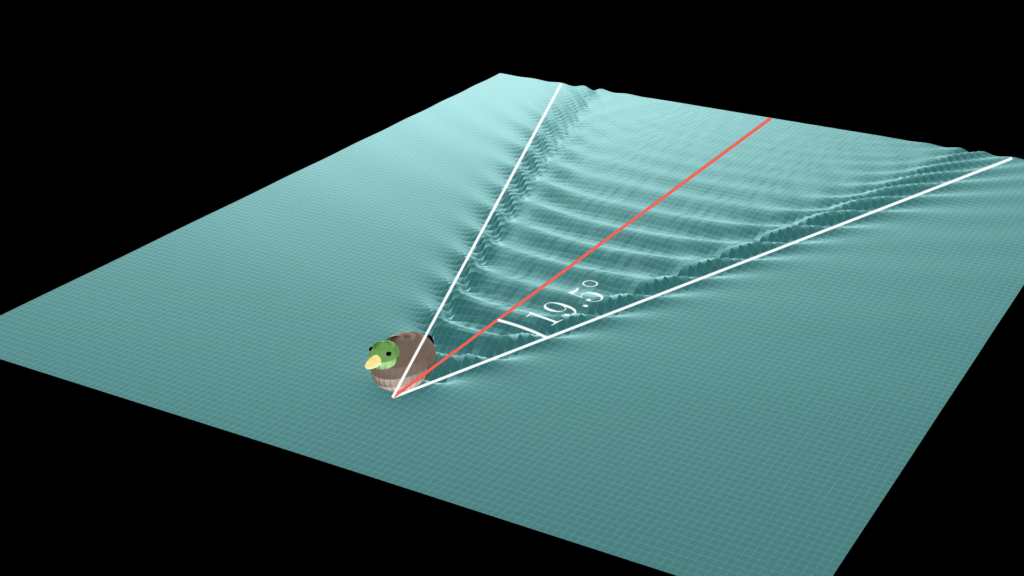
But wait! This circle goes far beyond the V-shaped wake we see… This is because to determine if a wave is stationary we use the phase velocity, but to figure out where the wave packet will be after some time, we need the group velocity. As we found out earlier, for deep water waves this is exactly half the phase velocity. So the stationary contributions from this one point in the past do not lie on the big circle but on the bright yellow one half its size. From the duck’s point of view, this circle lies within a fairly small angle determined by the white line tangent to the circle. With a bit of trigonometry we can determine that this angle is about 19.5 degrees.

Great! But if we draw a V at this angle on the duck’s wake, we see that the wave pattern goes slightly beyond it…

This is because we have made some simplifying assumptions. Most notably we thought of the individual waves as perfectly localized with a precisely defined speed. That’s an unrealistic idealisation.

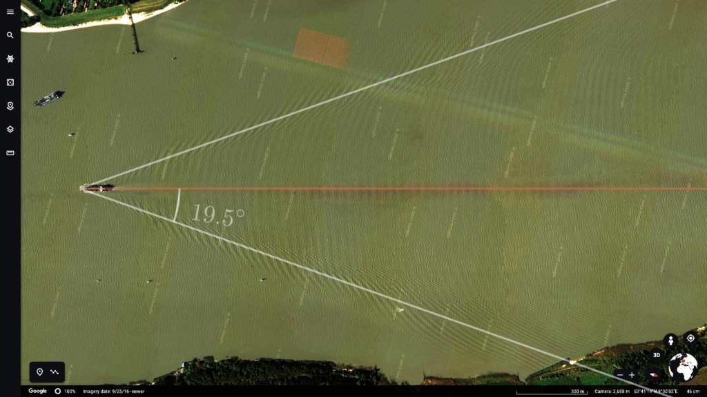
In practice waves will always affect at least a small area around the points where we imagine them to be, which is why the disturbance we see here reaches slightly beyond the angle we calculated. With this caveat, and with the assumptions that water is sufficiently deep and the moving object relatively slow, the angle of about 19.5 degrees is universal.

You can check this for yourself, for example by hunting around google maps for ships with a clearly visible wake, and measuring the angle.

Or you could go outside and ponder the waves on a pond or a lake.


YouTube video published on 2 September 2022

This page was updated 30 July 2026

The content of this page can be reused with attribution under the CC BY 4.0 license. 

Rainbows don’t work the way you think they work

This video on the mathematics behind rainbows communicates visually (without formulas) how the full story is more complicated, but also more beautiful, than “different wavelengths reflect at different angles”.

This video on the mathematics behind rainbows communicates visually (without formulas) how the full story is more complicated, but also more beautiful, than “different wavelengths reflect at different angles”.

Below the full video you can find an edited transcript with the individual animations inserted into it. After that there is some additional material on double rainbows.

Full video

Transcript with video snippets

You may already know how a rainbow forms. A key part of the explanation is that sunlight is reflected in raindrops at an angle of about 42 degrees. So we see the reflected light if we are somewhere on this cone of reflected rays.

Put differently, we see reflected light from those droplets that appear to be on an arc, which is centered around the point opposite to the sun. And we don’t see reflected light from any droplets away from this arc.

The angle of reflection is slightly different for different wavelengths of light, which we see as different colours, so instead of one circular arc of reflected sunlight we see a rainbow.


It’s a nice explanation, and not entirely wrong, but the full truth is much more interesting.

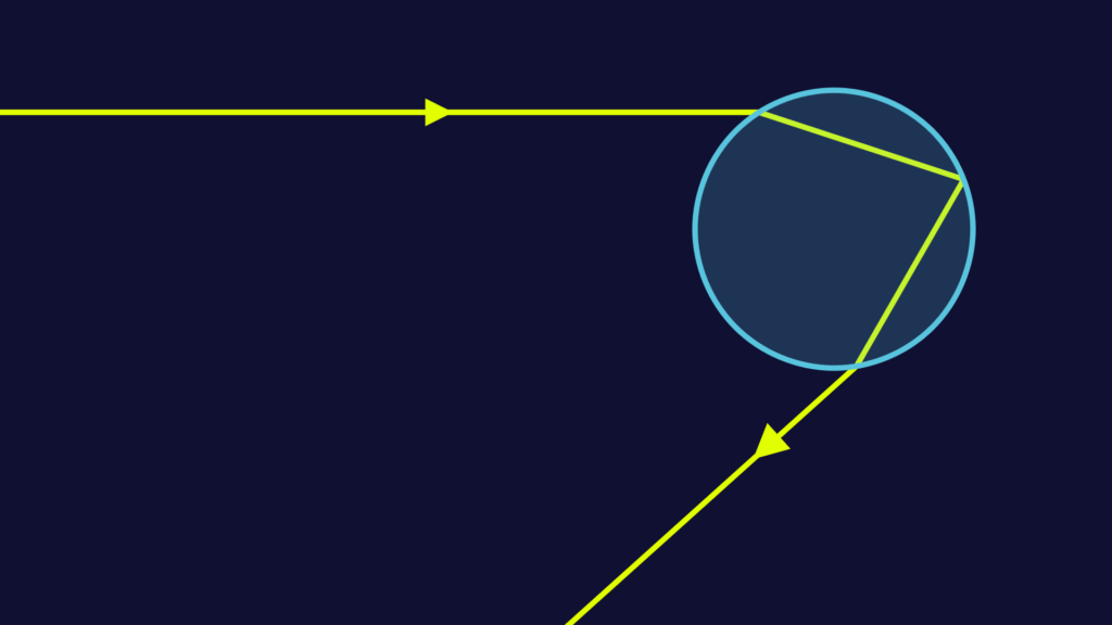
Let’s look at what happens within a single raindrop. The sunlight (coming in from the left) is broken, or “refracted”, as it enters the raindrop. Then it is reflected on the inside of the raindrop and finally refracted again when leaving it.

The breaking of light is related the fact that it moves more slowly in water than it does in air. (See this posts about variational principles.) The angle of refraction can be expressed using a formula called Snell’s law.

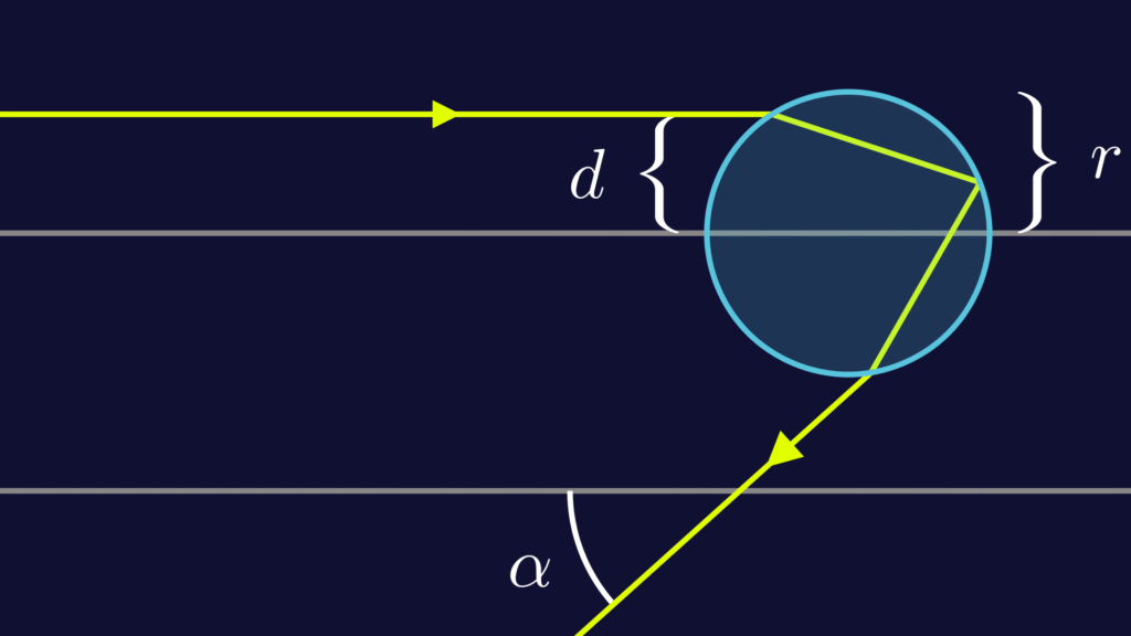
If you’re confident with trigonometry it’s a good exercise to calculate these angles. We won’t need exact formulas for this explanation to make sense, but if you manage to do this exercise, you’ll notice that the angle of the outbound ray depends on how far from the centre the inbound ray hits the raindrop. The angle, which we denote by \(\alpha\) (Greek letter alpha), depends on the distance \( d \) form the centre, as you can see in the animation below.

In hindsight, this shouldn’t be surprising. The angle certainly can’t always be 42°, because if the ray hits the droplet perfectly in the center, it will reflect back exactly the way it came.

It’s true that the angles depend a little on the wavelength of the light too, but the effect of changing the colour is much smaller than the effect of moving to or from the centre.

Let’s focus again on a single colour and draw a graph to visualise the dependence of the angle \(\alpha\) on the distance \(d\). We start at \(d=0\), which means the ray hits at the centre and the angle is zero too. When \(d\) increases, at first the angle \(\alpha\) increases too. But after a while the graphs flattens out and the angle reaches a maximum. When the ray moves even further from the center, the angle actually becomes smaller again.

We see that, depending on the value of \(d\), reflection is possible at any angle up to about 42 degrees.

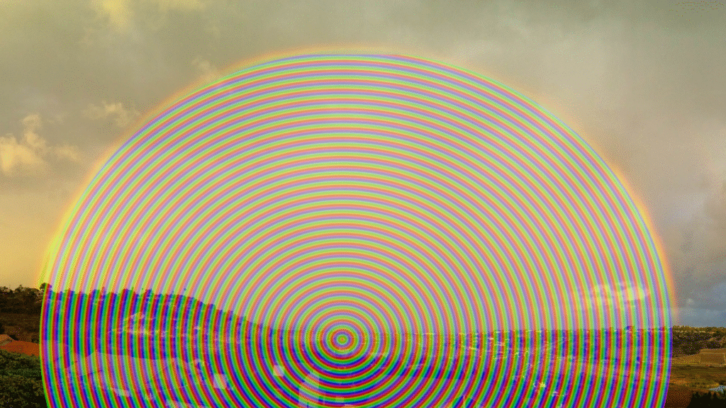
This is a bit strange, because this seems to imply that a rainbow would be a filled disk in the sky, rather than a circular arc.

A raindisk?? [Background photo: “Morning Rainbow” by Kodyak Tisch, CC BY 2.0]
The reason rainbows look the way they do, is that this graph reaches a maximum value and then goes down again. Whenever a smooth graph has such a maximum, a large portion of the input values will have output values very close to the maximum.

Another way to visualise this, is to look at lot of equally spaced incoming rays hitting our droplet. We see that a disproportionate amount of them reflect at or near the maximum angle.

On the graph these rays correspond to input values evenly distributed over the horizontal axis. After moving them to their output values, we see that the outputs are concentrated near the maximum value. This effect becomes more obvious when we consider more inputs rays.


Up to now we’ve only used light of a single wavelength (ie. of a single colour). The graphs for different wavelengths look very similar, with the notable difference that the maximum value is slightly different for each one. Hence the vertical bars representing our outputs will be of slightly different height, depending on the colour


Sunlight is a mixture of different colours. So what we really want to know is what these coloured bars look like when they overlap. This will give us a visual indication of how much light of which colour is reflected at each angle.

(People say the rainbow has 7 colours, but actually it has infinitely many. We’re using 6 here, which is a reasonable approximation.)

Finally, the light does not only get reflected vertically, but in all directions, so to visualise how the reflections actually look, we need to rotate this coloured bar around its lowest point, which corresponds to the angle zero and would be exactly opposite to where the sun is in the sky.

And voila. Here’s our rainbow. We see the bright arcs of differently coloured light, with a faint mix of colours inside of it, which looks more or less white to us.

So next time you see a shiny rainbow, see if you can tell that the inside of it is slightly brighter than the outside.

Additional material: double rainbows

So far we’ve assumed that the ray reflects exactly once inside the droplet. It could reflect multiple times, or leave the droplet without reflecting.

The most important of these cases is when the ray reflects twice inside the droplet. Let’s have a look at how different incoming rays get deflected in this case.

Again we can construct the graph of outgoing angle as a function of the distance \(d\).

This graph has a minimum instead of a maximum, but this will cause the same kind of concentration of outputs near the minimum angle.

Now let’s combine the graph for two reflections with the one for a single reflection and construct the rainbow…

We get a double rainbow with a dark band between the two bows.

In theory, there could also be a triple rainbow, quadruple rainbow, and so one. But with each additional reflection, the rainbow will get dimmer. In addition, the position of the theoretical third rainbow would be quite close to where the sun is, so in practice there is very little chance of ever seeing it.

YouTube video published on 22 August 2021

This page was updated 19 September 2025

The content of this page can be reused with attribution under the CC BY 4.0 license.